That which the gods seek to destroy, they first frighten with near misses. The Schocken store survived the pulverisation-bombing of central Stuttgart by inches and stood up as a symbol of commercial persistence among the ruins: remained to become an object of pilgrimage fora generation rediscovering its period and its designer, Eric Mendelsohn, and - just when it was beginning to be recognised as one of the true masterpieces of the twenties — its owners and Stuttgart’s megalomaniac traffic planners had it pulled down.
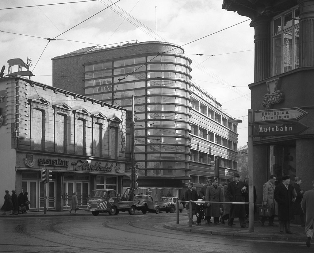
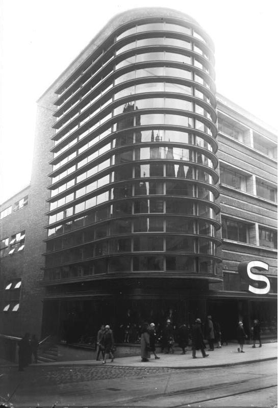
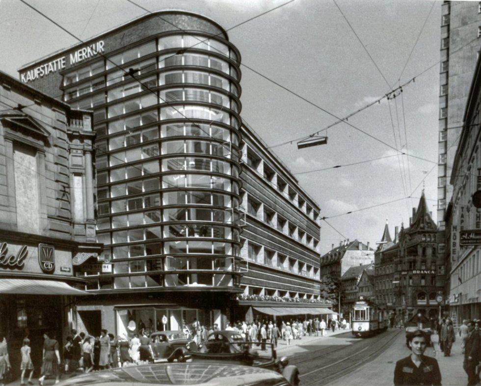
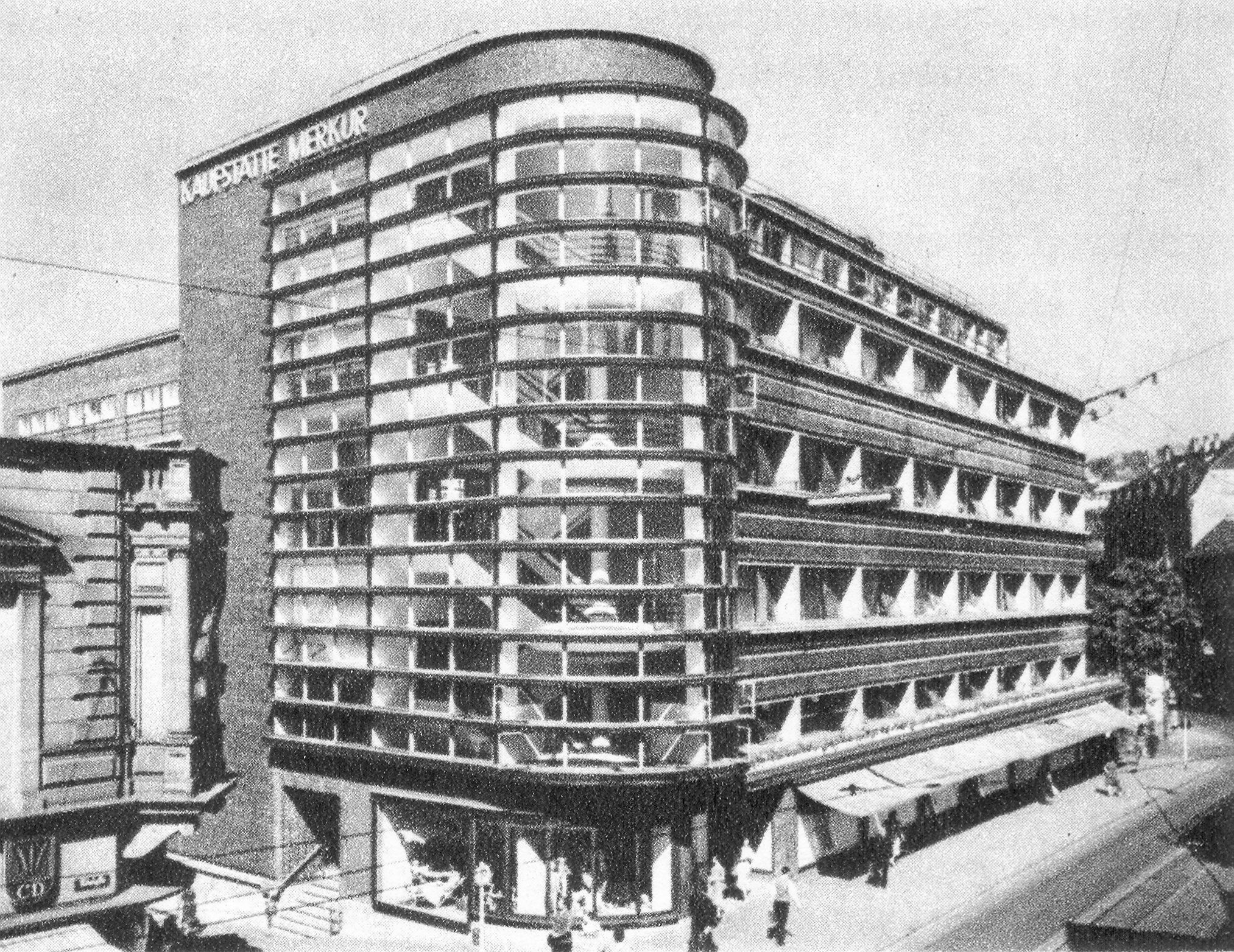
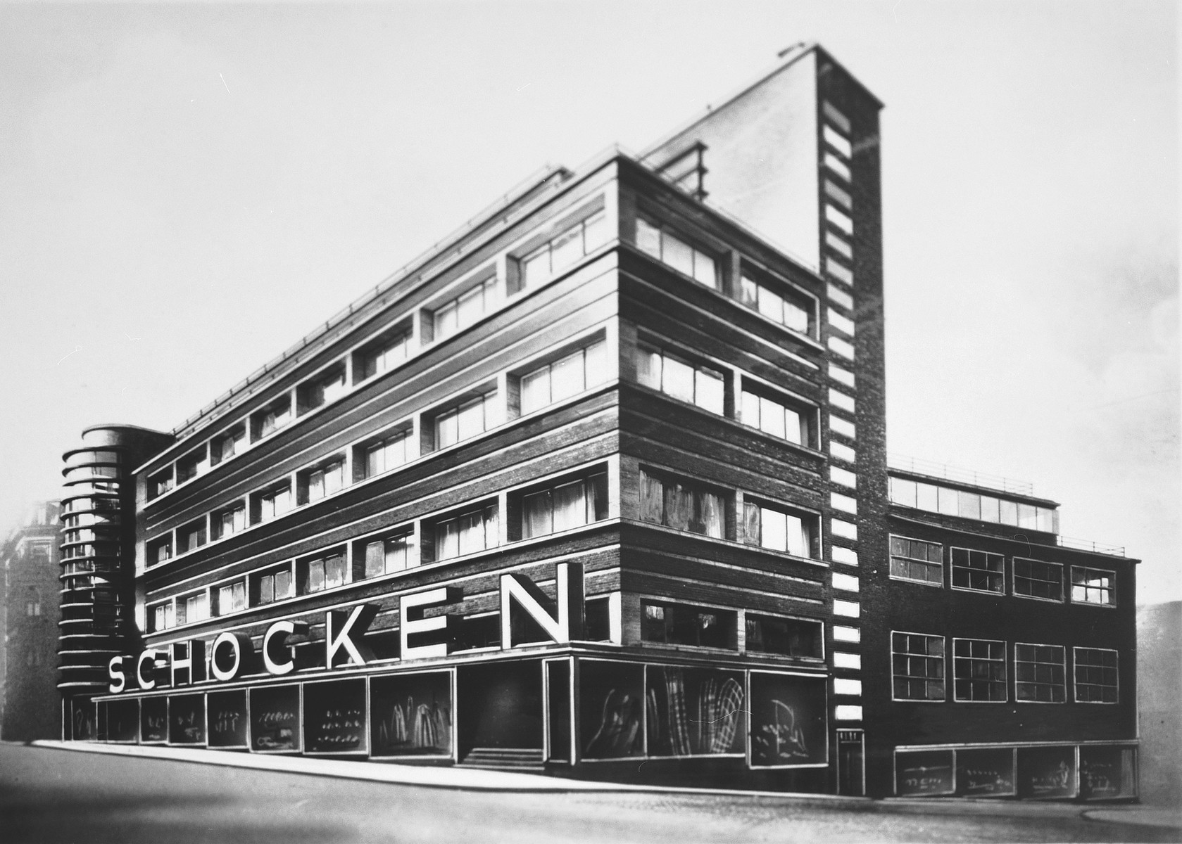
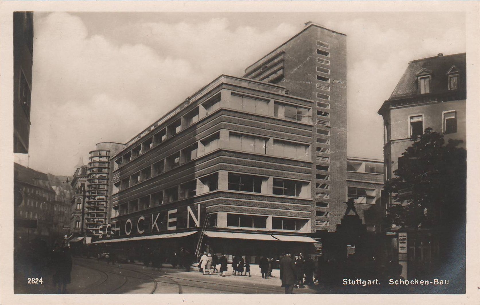
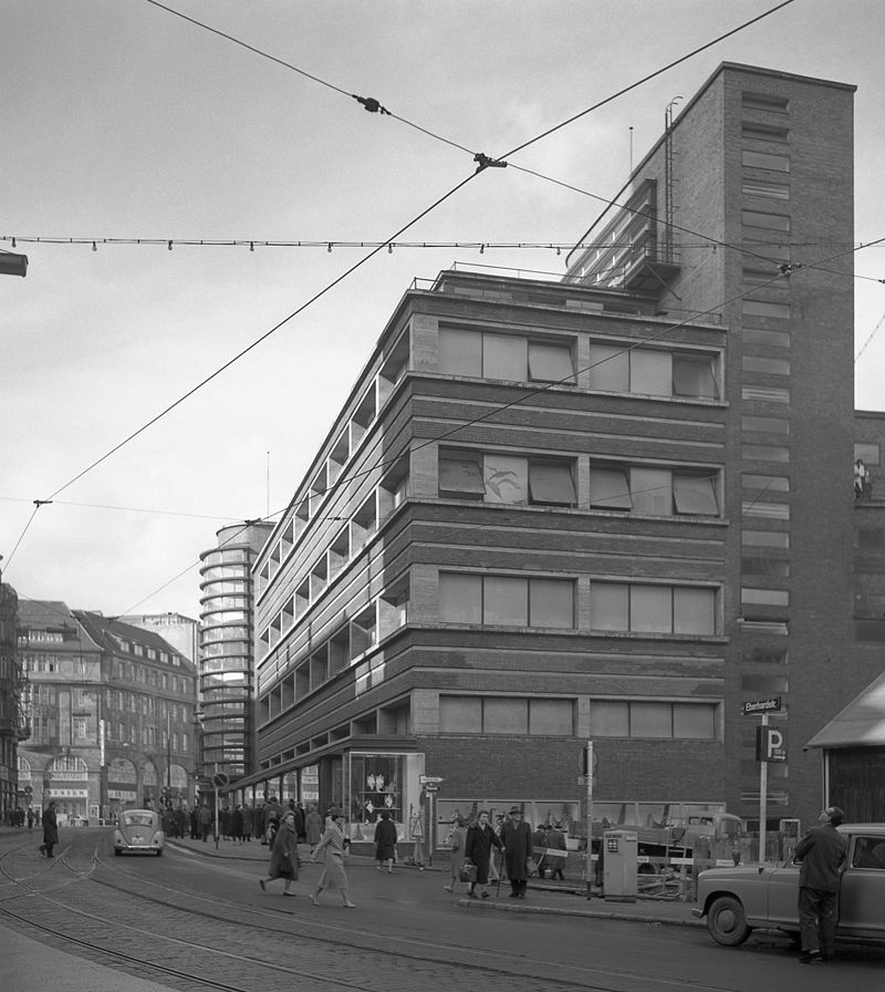
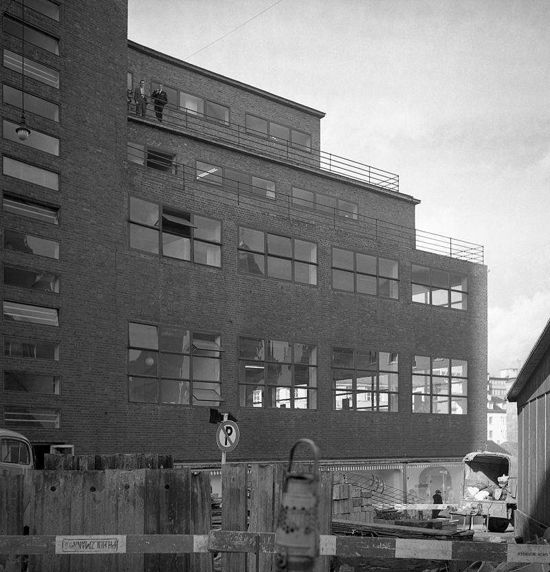
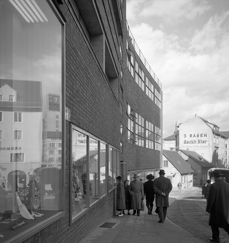
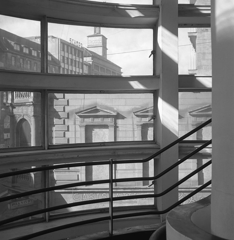
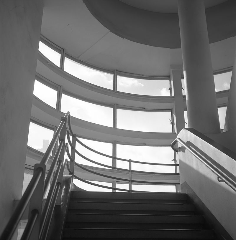
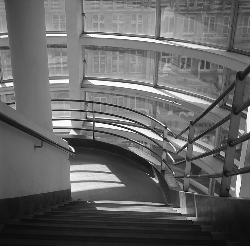
Mendelsohn has never been an easy architect to assess: his practice (largely commercial while he stayed in Germany) his patrons (Jewish) his doctrine (structural expressionism) and his vocabulary of rounded and rhetorical forms, are all rather alien to the mainstream of the modern movement, even though derived from similar sources (Wright, machinery, structural technique and so forth). All this would have been no bother had Mendelsohn been a negligible architect, but he was not. He was brilliant, perhaps a sort of genius, and he gave to department-store design the same kind of radical authority as Gropius could give to institutional buildings. His Columbushaus in Berlin, or his second Schocken store in Chemnitz, may seem more immediately convincing in photographs, but to encounter the Stuttgart version in the original was to see what he had to offer. Many architects have paid lip-service to the excitement of outdoor advertising, but Mendelsohn could really do it, he had the mind for reklame. Schocken's non-advertising side-walls were model exercises in unobtrusive but well-architected functionalism, but the main facade on the Eberhard-Ludwigstrasse was something else again. Its ground floor was, in sheer acreage of plate glass, competitive with any of its contemporaries, but above this the brick work of the side-walls slashed crisply across the glazing in a powerful pattern of horizontal stripes of solid and void to make a stunning background for giant three-dimensional cut-out lettering spelling SCHOCKEN (later altered to an under-scaled Kaufhaus Merkur). As its southern end the facade was closed by a projecting semi-circular stair-tower, the full height of the facade and entirely satisfying as a solid volume. But it was not a solid, between projecting cornice-strips as closely spaced as the fins on a motorcycle cylinder, one glimpsed through to shoppers on the stairs within. Or with a change in one’s position, or the fall of light, one got reflection instead of transparency, and suddenly saw the buildings on one's own side of the road, mirrored in extreme vertical distortion, transformed into ogres’castles and baroque cathedrals. It was everything eye-catching that advertising ought to be, but without cheapening the architecture: it wasmodernism with the popular touch, without cheapening the architect, and that - in sum - is what made Mendelsohn so hard to take for so long.
Banham R. Age of the Masters: A Personal View of Modern Architecture. Harper & Row., 1975. P. 100-101. |