| Description |
|
As arguably the first Postmodern building designed on a monumental, commercial
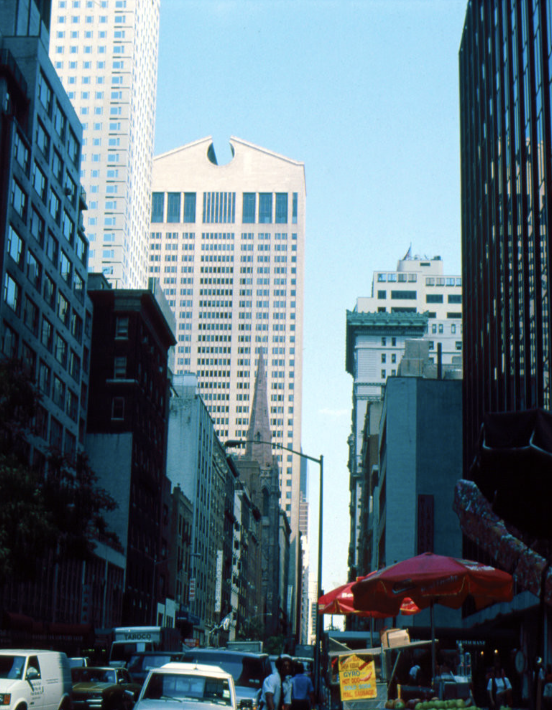
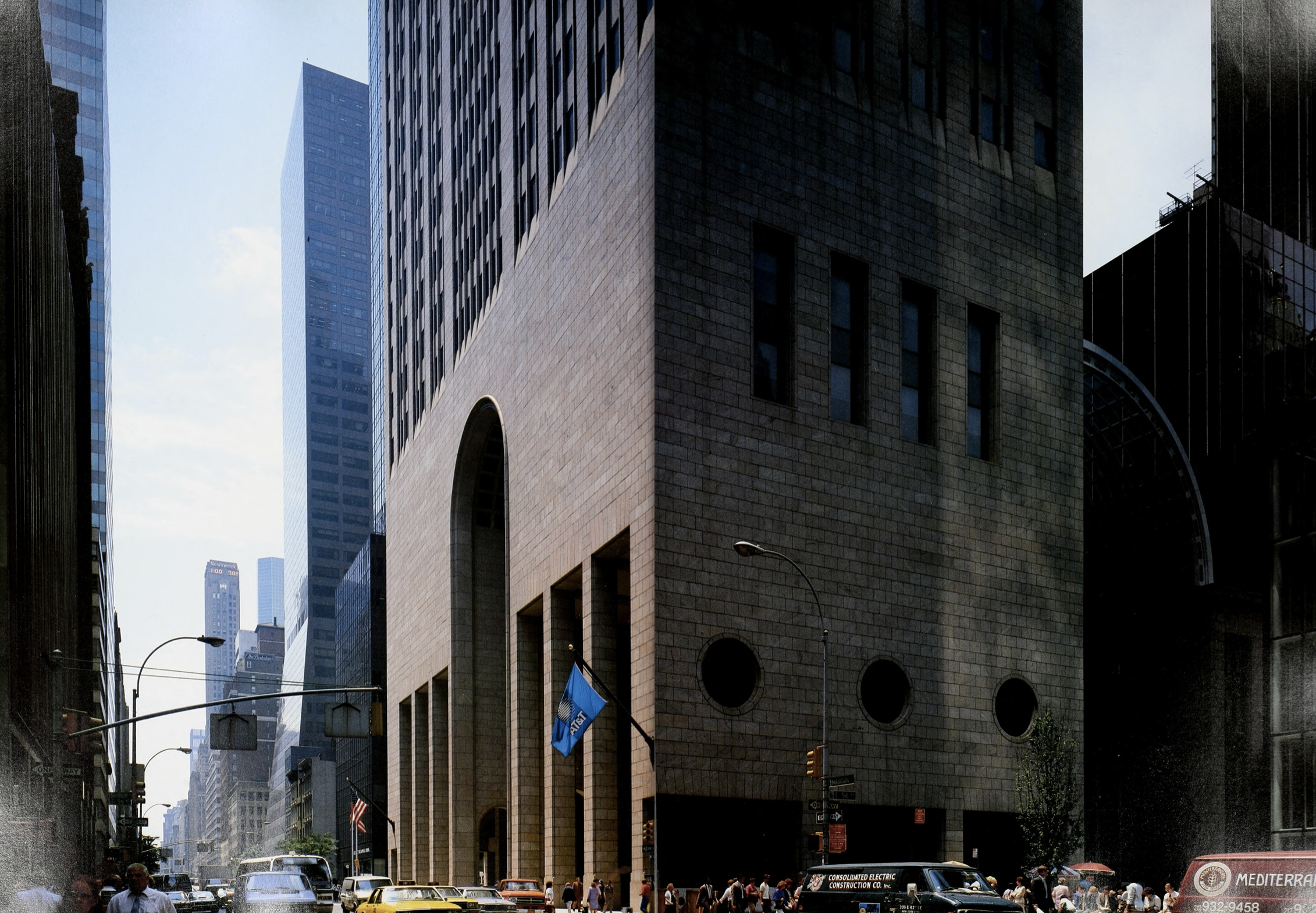
scale, the AT&T Building (completed in 1984 by Philip Johnson) generated sufficient popular interest to be front-page news in the New York Times on 31 March 1978 and the cover story in Time on 8 January 1979, which portrayed the architect Philip Johnson cradling a model of the proposed design. In legitimizing Postmodern style and ideas, it reversed almost three decades of modern principles espoused by Mies van der Rohe that Johnson himself had practiced with the master in the Seagram Building (1958). Gone are the open plaza (the externalization of universal space); the understated, monochromatic, almost mute metal- and-glass curtain wall; and the nonconformist, neo-Baroque setback from the avenue. Instead, Johnson’s building presses directly against the site line along the entire block of Madison Avenue between East 55th and East 56th Streets and introduces a newer type of urban amenity: a glass-canopied atrium with retail establishments. Several similarities to the Seagram Building remain, however, in the deeply recessed ground-story lobbies, overall floor plans, and steel construction. In fact, the plan is typical of postwar high-rise office buildings, comprising a sizable service core of elevators, emergency stairwells, and rest rooms, with resultant narrow office spaces.
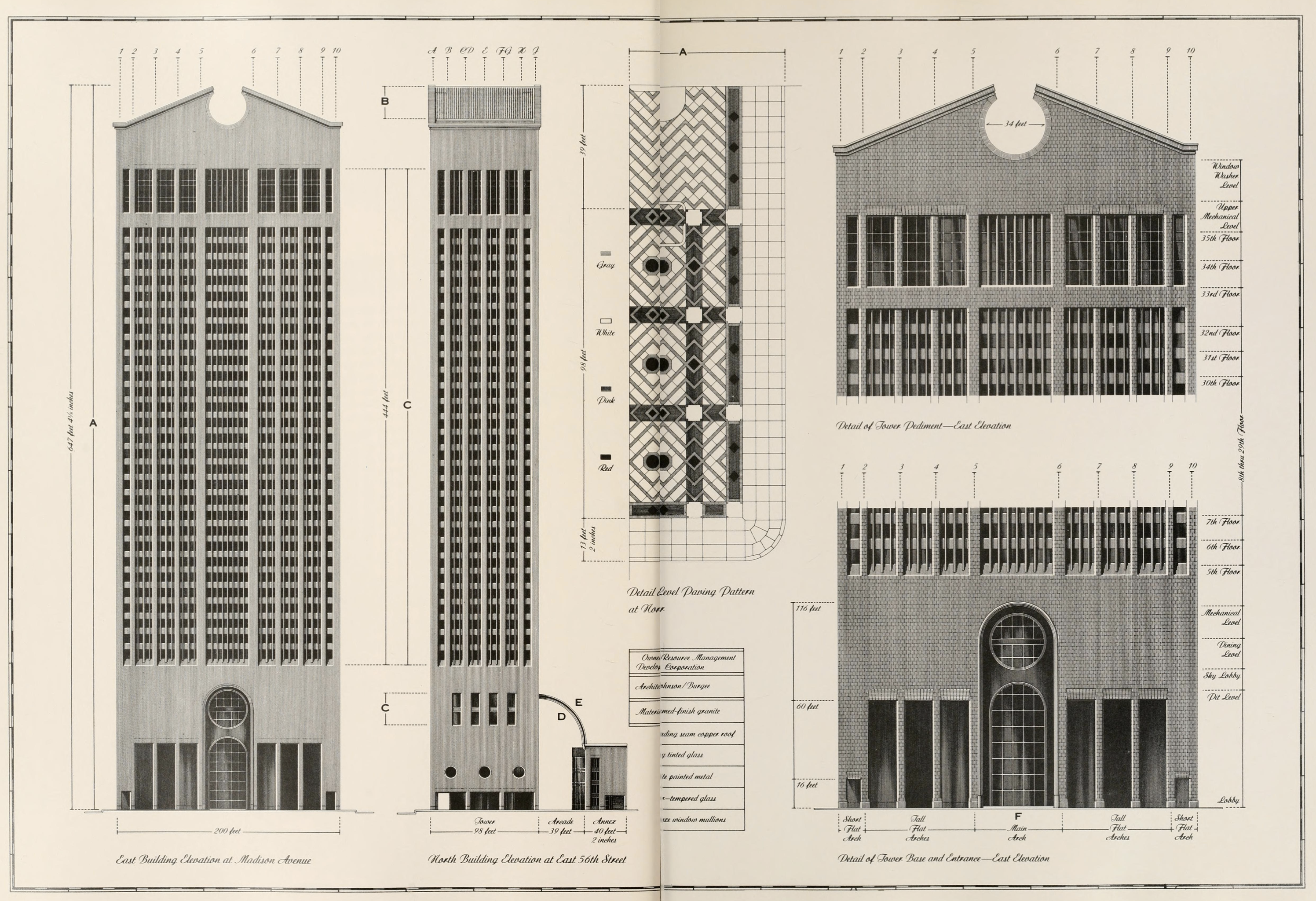
Discussions for the design began in the mid-1970s with AT&T, ironically one of the world’s largest corporations before its divestiture only shortly after the erection of the building. At a cost of $200 million, the 648-foot-high, 37-story building dedicated ten of its stories to its eponymous corporation, with the remaining rented as general office floors.
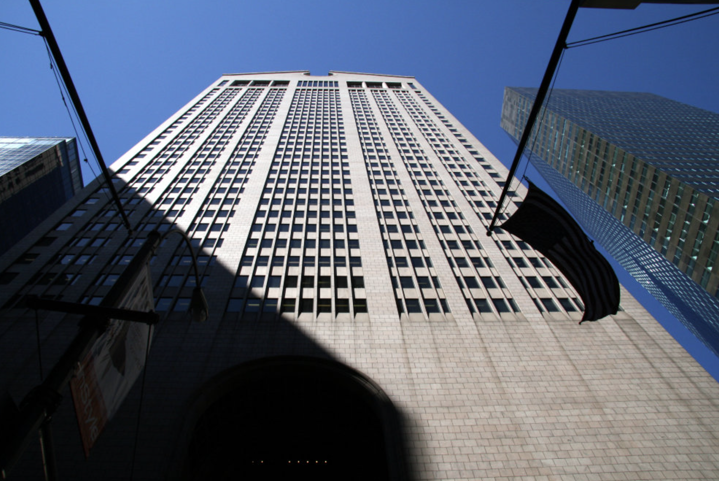
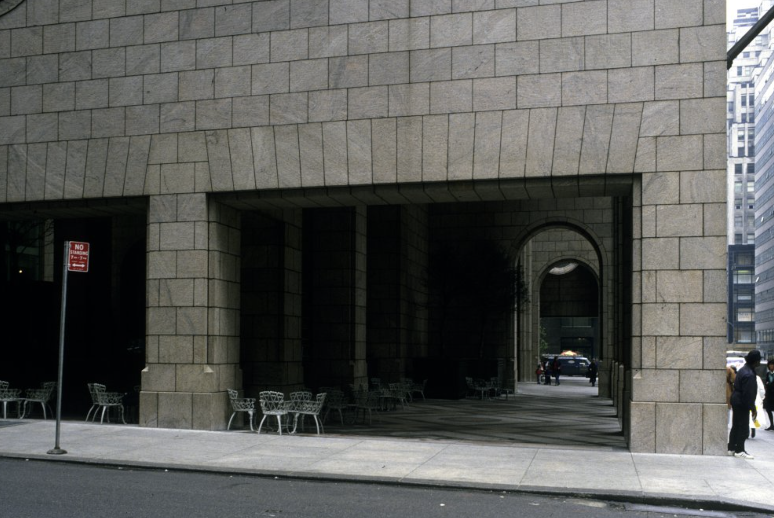
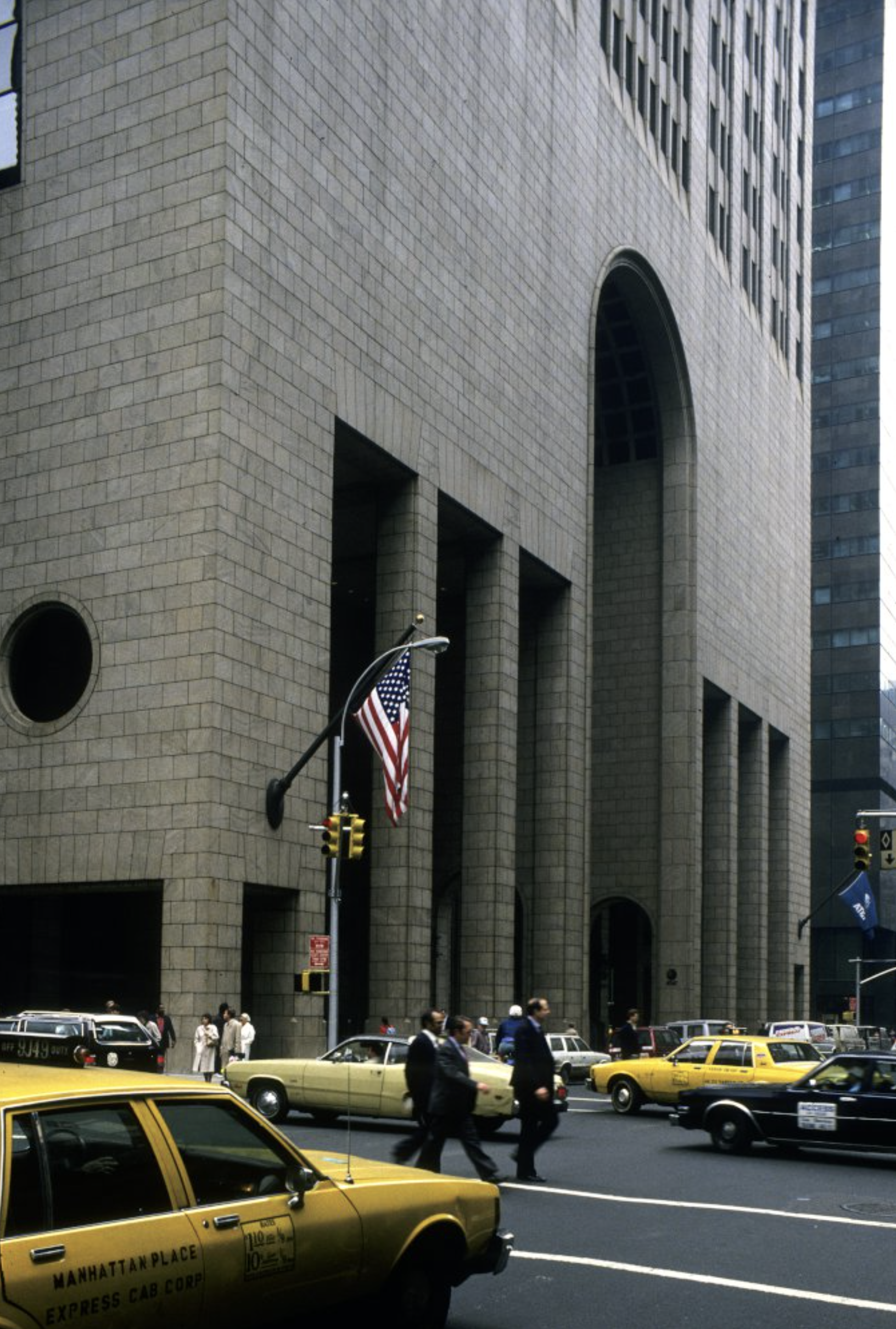
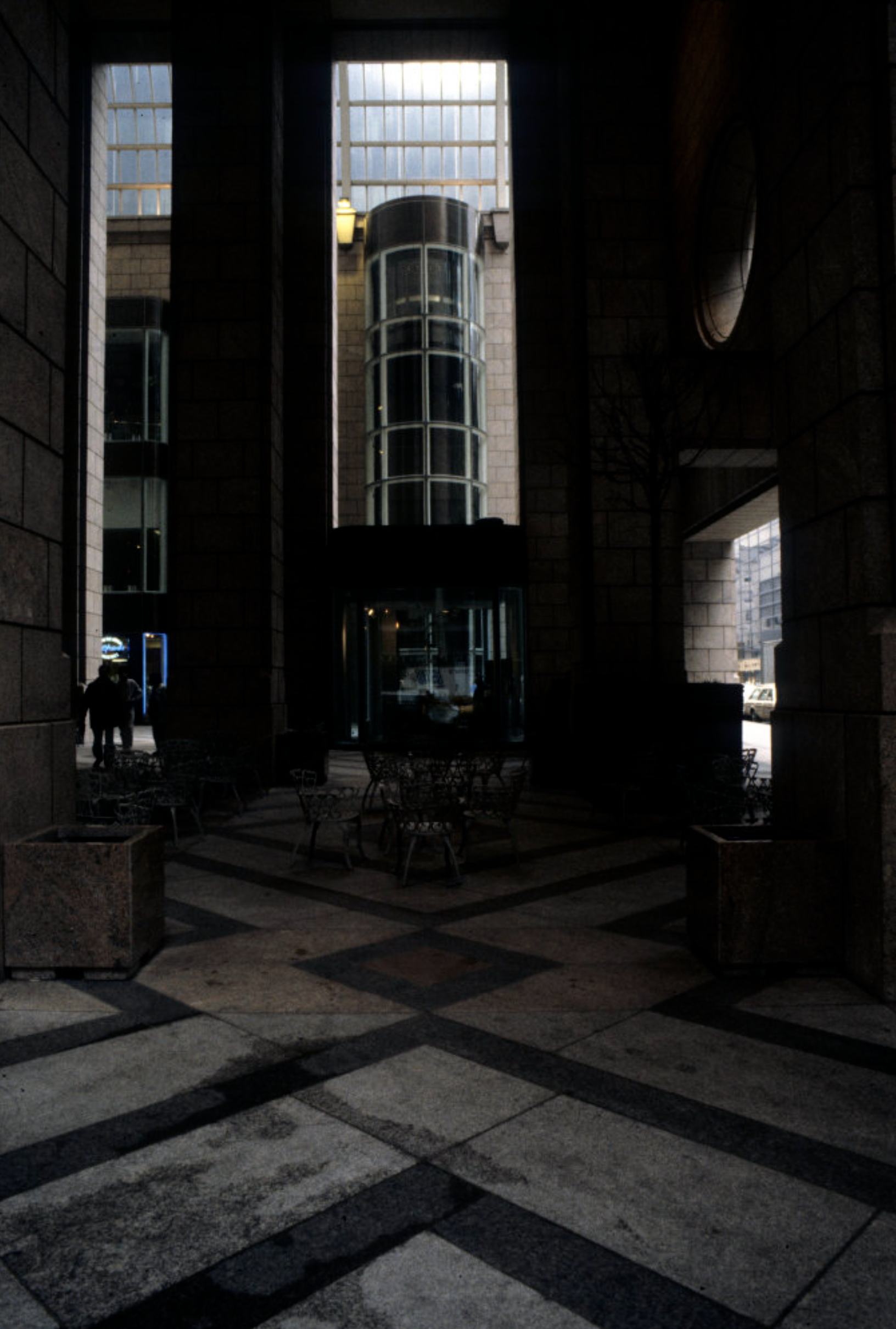
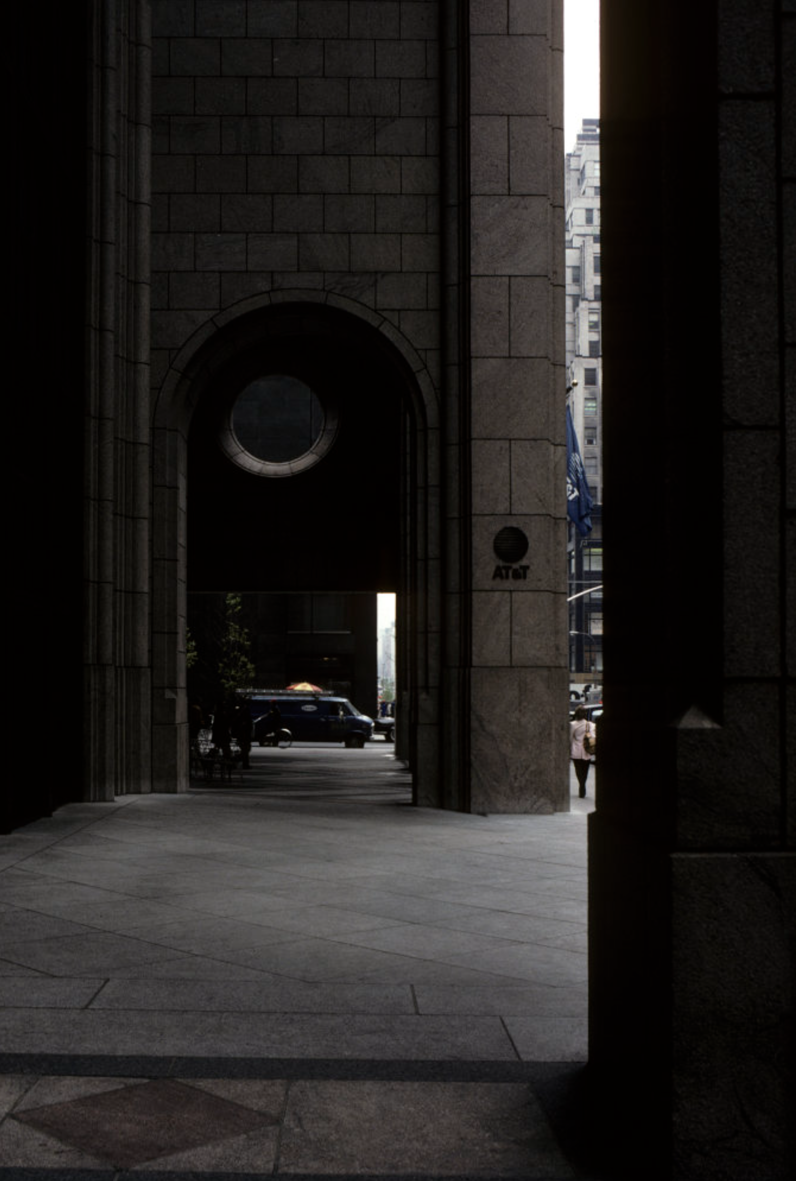
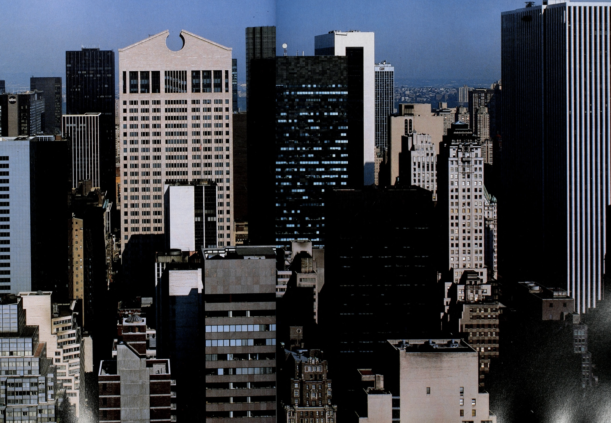
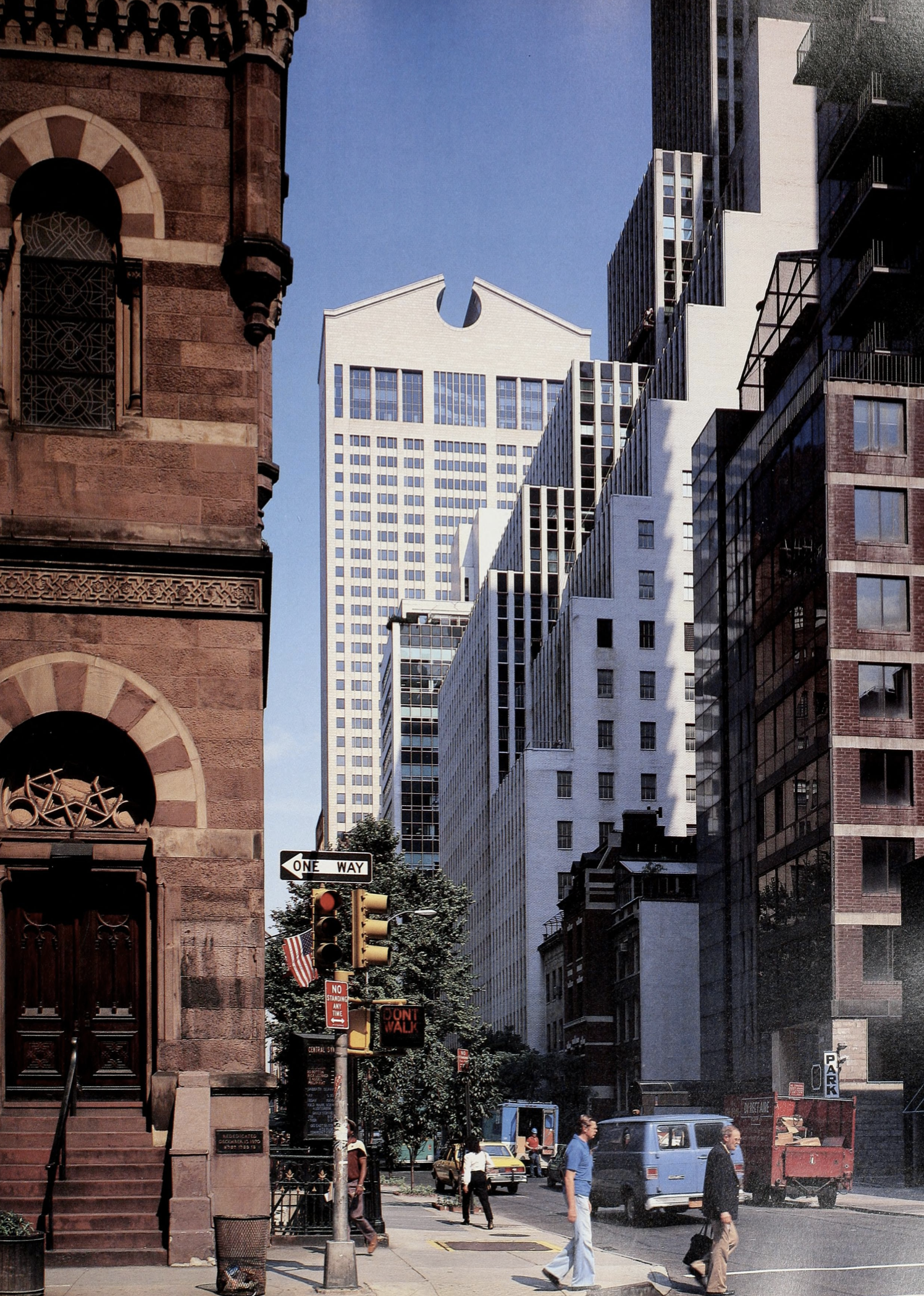
Its two central Postmodern features are the selection of a masonry enclosure, a light pink granite, and the addition of a crowning broken pediment. The latter feature fueled the nickname the “Chippendale” skyscraper, presumably because of its association with Thomas Chippendale’s highboy chest-on-chests rather than with its actual but much rarer architectural source in 18th-century Georgian entrances. Because of the density of the location, the pedestrian experiences the building at two scales: from the street, the ground-level arcades, and from a considerable distance, the signature broken pediment. Originally, the ground level of the tower comprised open arcades around
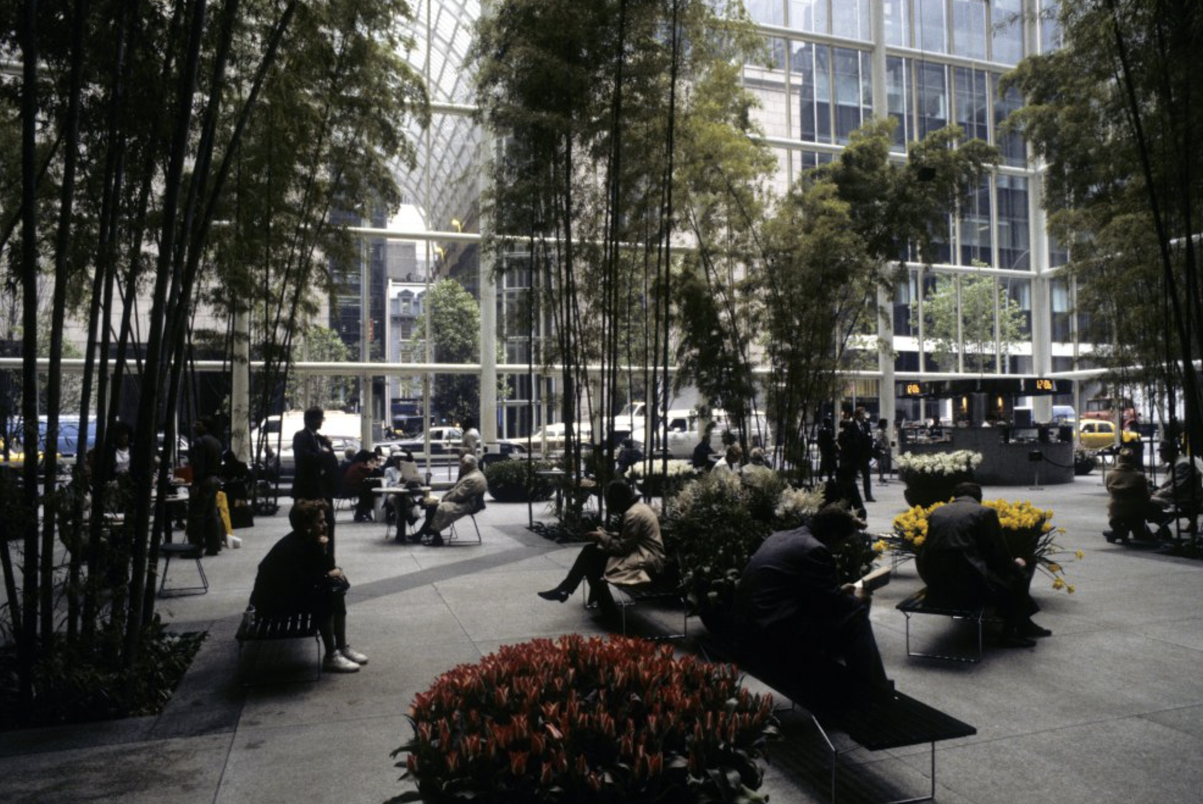
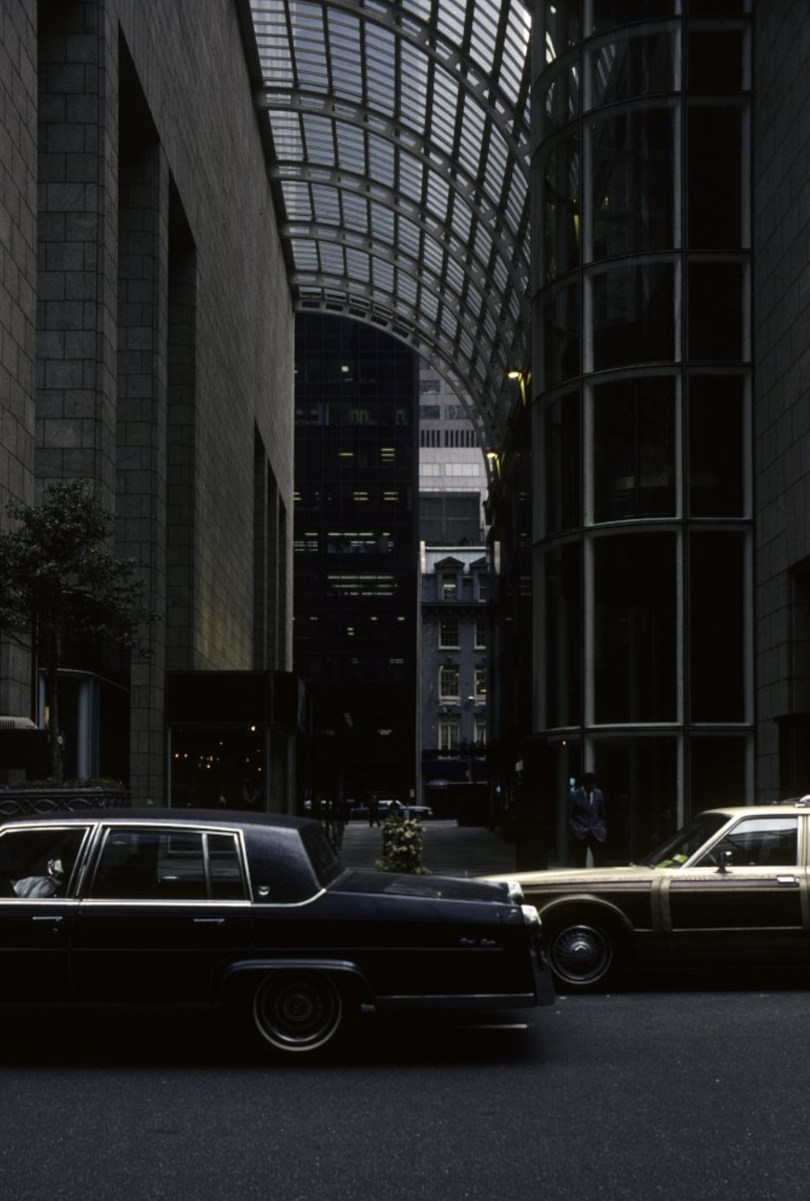
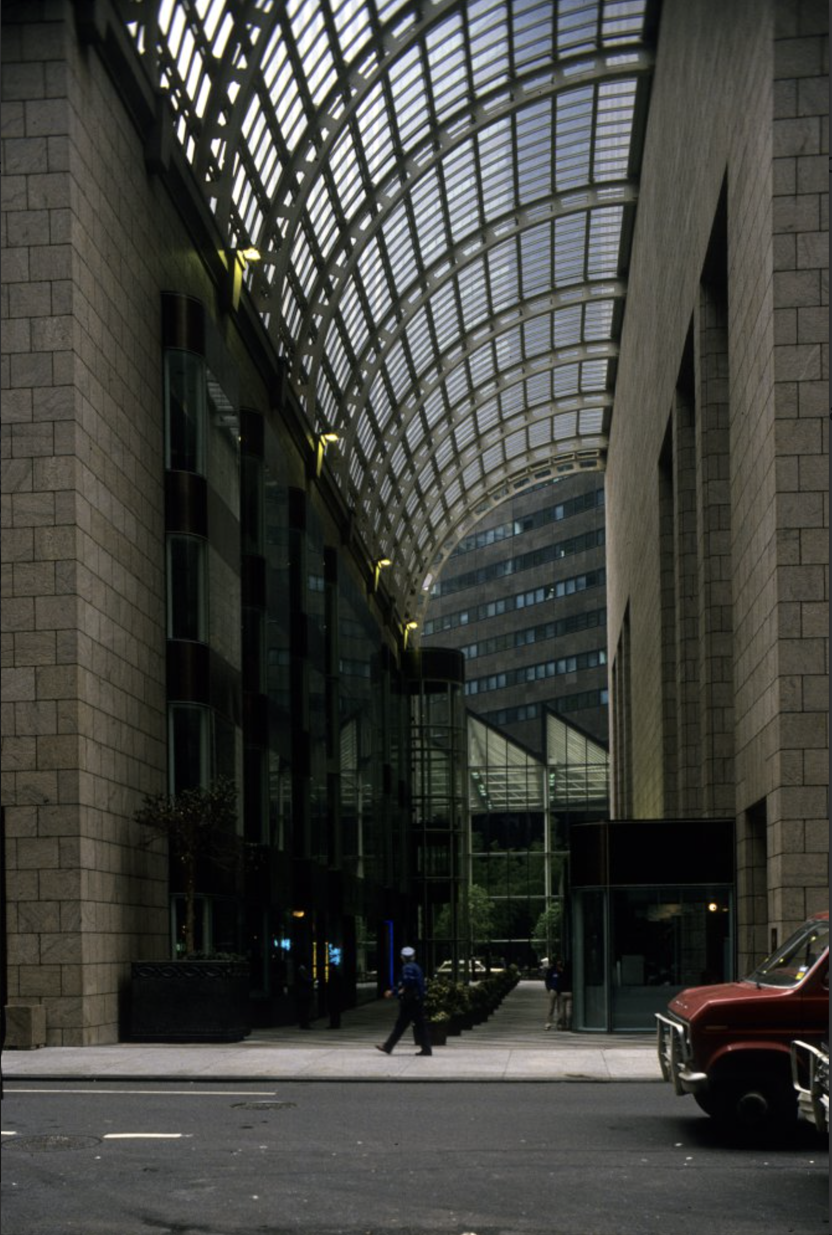
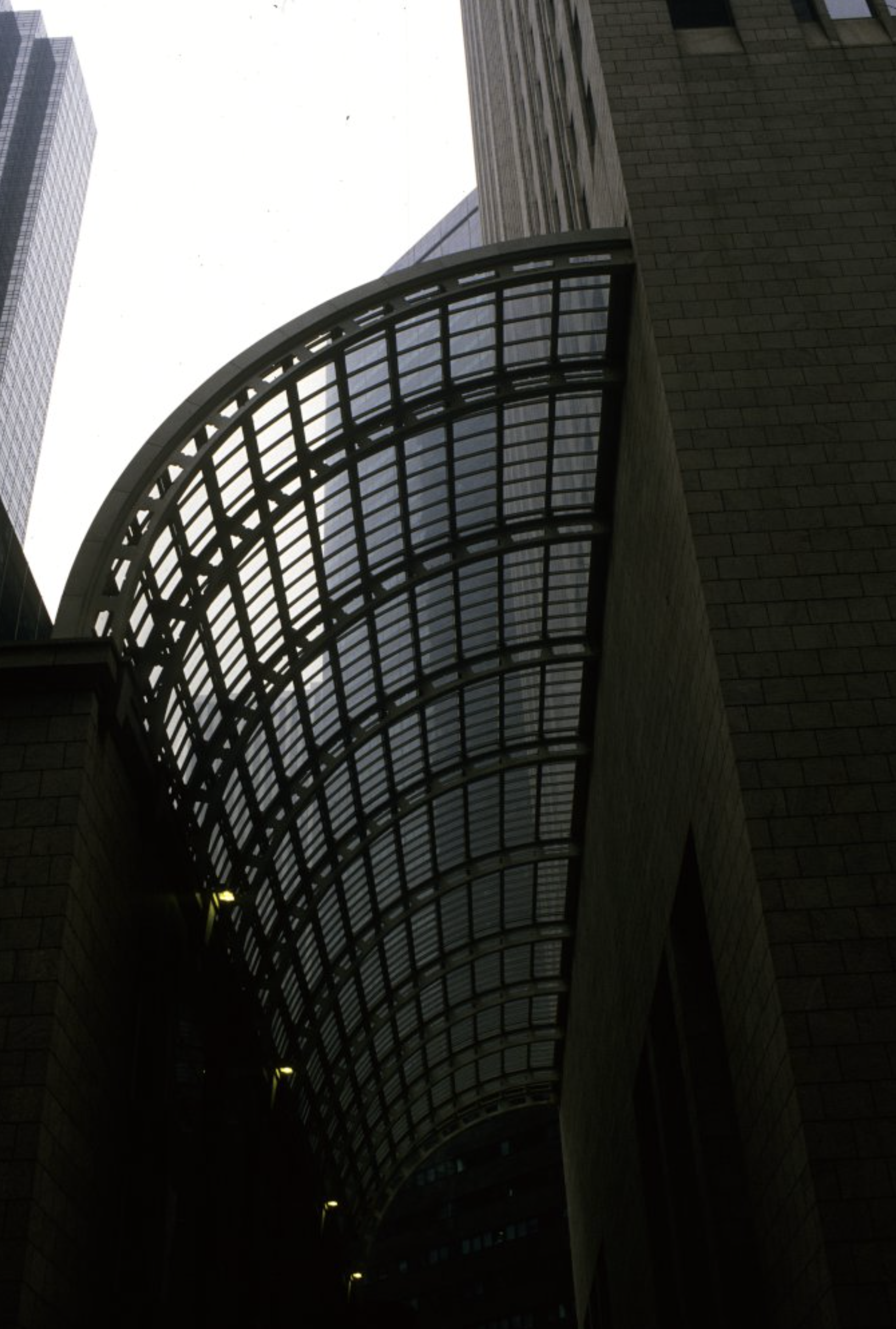
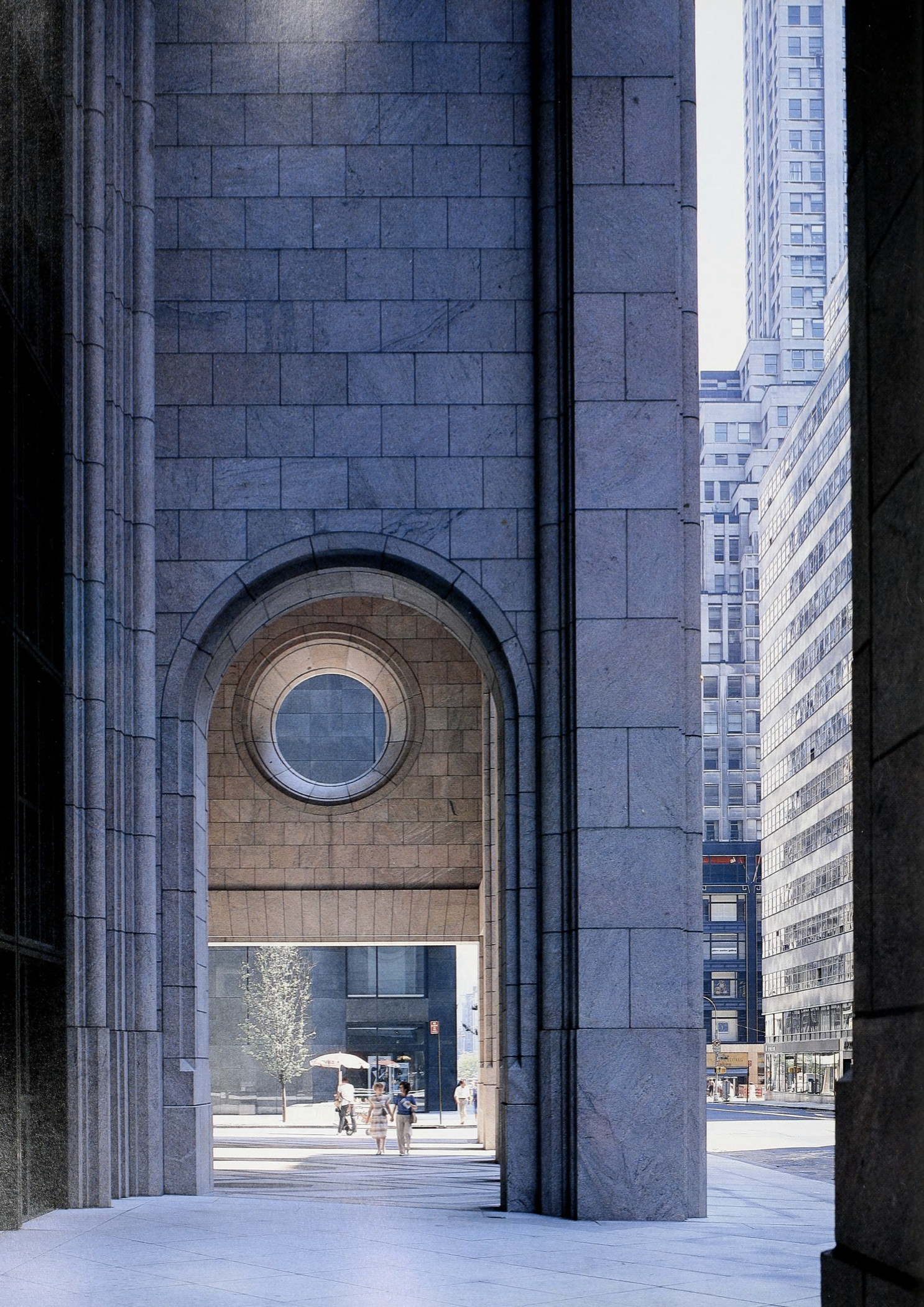
the small entrance lobby and service core. The unenclosed public space beneath the tower, compared to an Egyptian hypostyle hall by one historian, was intended to mitigate the intensive use of the site and to repay the absence of setbacks in the tower. At the rear of the site, a glass- canopied galleria in the spirit of Milan’s Galleria Vittorio Emanuele (1867) contains a three-story row of shops. A quarter of a barrel vault, the canopy is supported by quarter-round arches, not unlike the Romanesque tunnel-vaulted nave of St.-Sernin (1100) in Toulouse, France. Concentric diamond and chevron patterns animate the granite floors. In 1994 Gwathmey Siegel and Associates, in an effort to respond to criticism of insufficiently sheltered public spaces, enclosed both the public arcades beneath the tower and the galleria, which was extended into one bay on either side of the elevator core. By creating deep shadows, Gwathmey Siegel’s bay windows for storefronts retain the feeling of depth in the arcade openings.
The most tactile experience occurs at the street level, where the flame-finished pale pink Stony Creek granite cladding meets the ground. Above substantial square column bases rise piers with reentrant corners, and quarter pyramids mark this articulation. Johnson has claimed that the entrance composition, with its central arch flanked by narrower trabeated openings, recalled Filippo Brunelleschi’s Pazzi Chapel (1429) at Santa Croce, Florence, although critics did not hold both in equal esteem. Following the rhythm of openings established at the ground level, uninterrupted vertical bays contain granite mullions between piers, anchored underneath to steel tubes and originally intended to be round sectioned. Cost containment prevented the materialization of this feature, and in combination with the insufficient suppression of windows into the wall, AT&T’s resultant thinness has been a frequent source of criticism, which compared the building unfavorably with Louis Sullivan’s Wainwright Building (1891) in St. Louis, Missouri, admired for the expressive qualities of its brick masonry and molded terra- cotta. More successful, however, are the upper-level executive floors, where deeper suppression of the glazing and round-sectioned mullions were realized. Also lamented were the bare expanses of granite between the entrance arcade and the office floors as well as between the upper-level executive office floors and the sloping edges of the pediment, the subtle cornice of which, however, was praised.
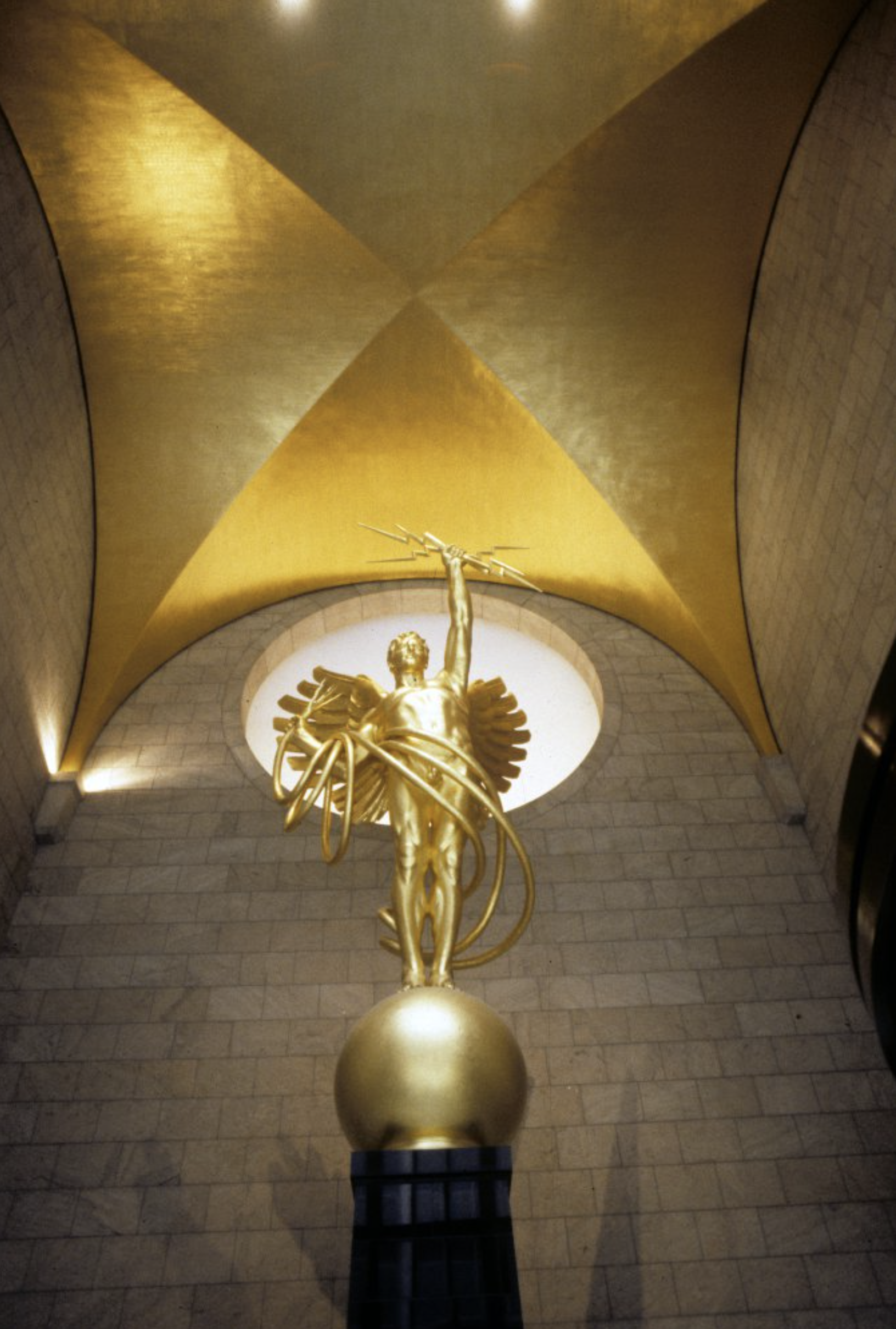
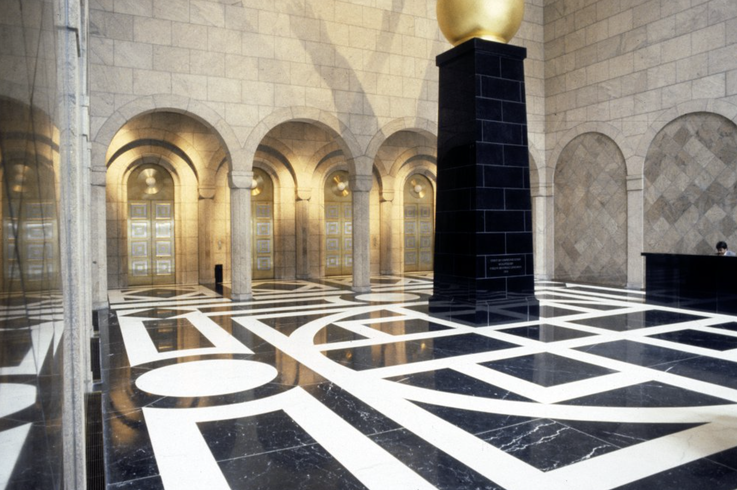
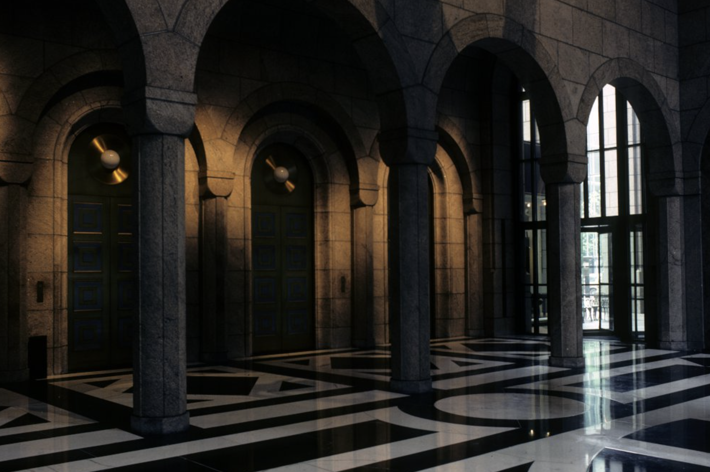
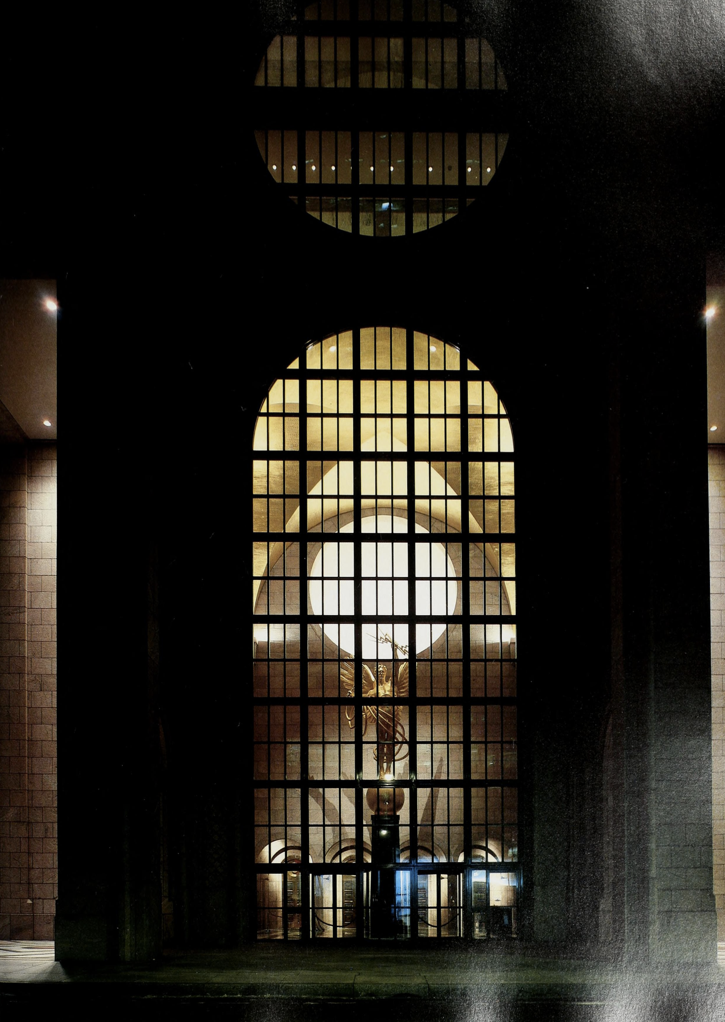
At the main entrance, a suppressed glazed entrance arch, with an oculus above, echoes the narrow 116-foot central arch. Lavish detailing of the material includes a diamond pattern, or opus reticulatum, in the apron around the openings and fully threedimensional articulated moldings around the arch and in corners. Capped with a gilded cross vault that springs from corner brackets, the compact but well-proportioned 65-foot-tall lobby has a black-and-white marble floor pattern recalling Durbar Hall (1931) at the Viceroy’s House in New Delhi, India, designed by Sir Edwin Lutyens. Lined with granite walls as well, the lobby precedes a barrel-vaulted elevator hall; columns with abstracted Byzantine capitals demarcate the two spaces. Among the renovations supervised by Gwathmey Siegel and Associates, black glass replaced the diamond-patterned granite in the blind lobby arches. Bronze elevator doors, set in a blind arcade, repeat the arched forms. The regilded sculpture Genius of Electricity (1916), by Evelyn Beatrice Longman, known popularly as Golden Boy, from the top of the earlier headquarters, was replaced, after the Sony Corporation purchased the building, by an untitled nonobjective Joel Shapiro (1941-) sculpture.
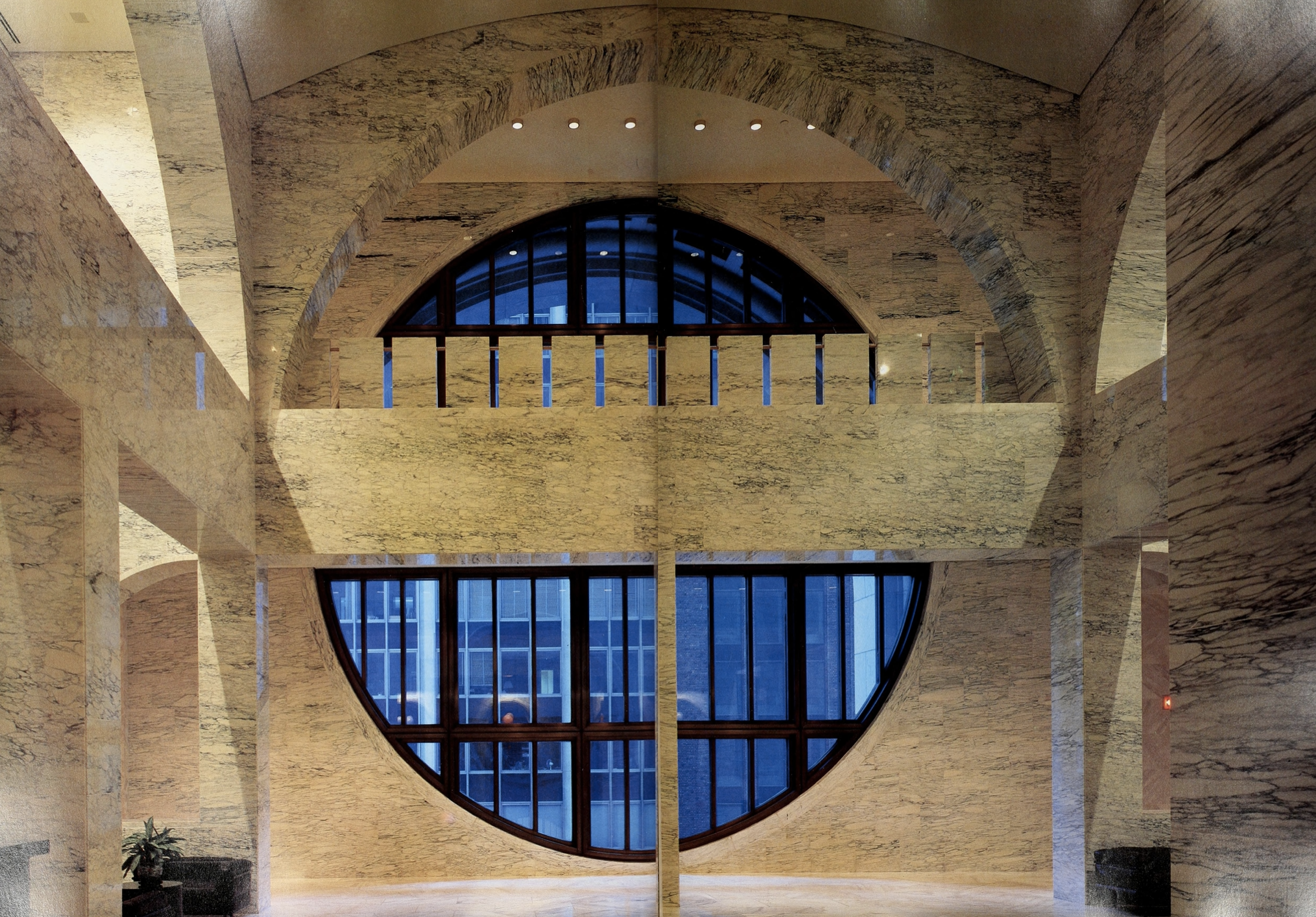
Called the “sky lobby,” the main reception area sits one level above ground behind the entrance oculus. Its veined Breccia Strazzema marble forms a central aedicule enclosed by halfround arches springing from linteled openings. Gwathmey Siegel and Associates softened surfaces with wood panels, black glass, and murals. In the middle section of the building, there are 27 standard office floors, with ten-foot heights, and the executive offices occupy the 33rd and 34th floors. In them, Johnson specified molded wood panels and a double grand staircase connecting the two levels. Ventilation is diffused between vinyl-clad metal acoustical ceiling panels, and task lighting illuminates each workstation.
Considered flamboyant and arbitrary by some, frivolous and stylistically promiscuous by others, the building design generated ample criticism. Its historical references, reduced to two dimensions, were said to lack symbolic weight. Still, in its superficial use of the grammar of architecture, the AT&T Building expresses a perhaps unconscious camp quality, and as an object of the resentment of Postmodernism for its esoteric references and ad hoc assembly of historical images, AT&T represents at the same time the overthrow of orthodox modernism.
PAUL GLASSMAN
Sennott R.S. Encyclopedia of twentieth century architecture, Vol.1 (A-F). Fitzroy Dearborn., 2004.
Further Reading
Periodical literature published when the building was completed provides the strongest analyses and most insightful critical responses.
Banham, Reyner, “AT&T Offices, New York: The Post-Déco Skyscraper,” Architectural Review, vol. 176 (August 1984)
Canty, Donald, “AT&T: The Tower, the Skyline, and the Street,” Architecture, vol. 74 (February 1985)
Curtis, William J. R., “Modern Transformation of Classicism,” Architectural Review, vol. 176 (August 1984)
Doubilet, Susan, “Not Enough Said: AT&T Headquarters, New York, N.Y.,” Progressive Architecture, vol. 65 (February 1984)
Frampton, Kenneth (editor), Philip Johnson, Processes: The Glass House, 1949, and the AT&T Corporate Headquarters, 1978 (exhib. cat.), New York: Institute for Architecture and Urban Studies, 1978
Goldberger, Paul, “A Monument to Post-Modernism,” New York Times, 31 March 1978
Hughes, Robert, “Doing Their Own Thing,” Time, 8 January 1979
Huxtable, Ada Louise, “Johnson’s Latest—Clever Tricks or True Art?” New York Times, 16 April 1978
“John Burgee Architects with Philip Johnson: AT&T Headquarters, New York, New York: Ground Breaking: January 1979; Completion: 1984,” GA Document, no. 12 (January 1985)
Knight, Carleton, “Significant Clients: Ma Bell Builds Big,” Architecture: The AIA Journal, vol. 72 (July 1983)
Philip Johnson/John Burgee: Architecture 1979–1985, New York: Rizzoli, 1985; revised edition, 1989
Schulze, Franz, Philip Johnson: Life and Work, New York: Knopf, 1994 |